Donna Karan's Design Principle and Inspirations
As Donna Karan is an environmental care person, she does not use real leather or any furs. Fabrics used are mainly made of wool, natural and synthetic fiber.
Donna Karan creates styles for the career woman; styles she says she feels comfortable in. She used a lot of stretch fabrics and sensuous body wrap styles.
Her designs are never been just about clothes. It's about lifestyles.
Donna Karan's designs show that clothes should be interchangeable and flexible enough to go “from day to evening, summer to winter”. She finds her inspirations in the New York City and the global environment. She has reflected her care and interest of the things happening around her in her designs. New York features are shown in the fall winter collections, while the spring summer collections reflects her care about the natural environment
Use of Color
Usually, there are no more than 3 color combinations in a single of her collection and there are no more than 3 colors in a single outfit. Except the Graffiti prints in Spring 2006.
The principle of familiarity is one of her most used coloring theory.
She loved to use natural colors and features in her collection as these designs are popular among successful career women, because they do pay attention to the decaying environment as Donna Karan.
In fall winter seasons, Black & Grey are usually used as the main colors (Achromatic). In order to interest audiences' eyes, Black & Grey are shown in different textures. Brown, Red or Purple is usually added to the Black/Grey pieces, as they are common "Mistress Color". The 3 colors are applied to give a sense of warmth in the winter collections. These matches well with each other in the form of Analogous. In Fall 2007, Blue is added to the collection to make the scene cooler. Purple & Burgundy is also applied.
In each collection, 1-3 pieces of designs are out of the color family featured. For example, the Shimmering Yellow one-piece in Fall 2007 and the Lime dress in Spring 2004. Using colors outside the color family may interests audiences' eyes and can experiment Donna Karan's target customers' acceptance in new color.
 Lady Diana Spencer – Married Prince Charles in 1980 and she is one of the famous Fashion Icon in the 90s
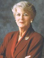 Geraldine Ferraro – Runs with Waliter Mondale for US presidency.
 Donna Karan – Founds her own label in 1984, and now she is one of the famous world designers.